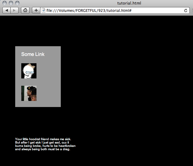
The page will look like this with our text appearing below the link box and our image appearing to the side of the link box.

Step 1: Download these images and name the accordingly for ease of using the code samples I provide.
thumb.jpg

fbthumb.jpg

facebook.jpg

Step 2: You'll need a basic HTML page and an attached external style sheet or space between your head tags for an internal style sheet. Put a single <div> with the id="box" in the body. This is where we will place the link text and image that we will hover over with the mouse.
<!DOCTYPE HTML PUBLIC "-//W3C//DTD HTML 4.01//EN"
"http://www.w3.org/TR/html4/strict.dtd">
<html>
<head>
<style type="text/css">
"http://www.w3.org/TR/html4/strict.dtd">
<html>
<head>
<style type="text/css">
</style>
</head>
<body>
</body>
</html>
Step 3: Lets add the content. The first thing we add will be a text link. Here's mine:
<a href="#">Some Link<span>Your little hoodrat friend makes me sick. But after I get sick I just get sad, cuz it burns being broke, hurts to be heartbroken and always being both must be a drag. </span></a>
Breakdown: The anchor tag encapsulates the whole thing. Just after the a tag we have the words that will actually appear as the link text. Just after that we have a span tag with some other text content. This text can be whatever you want. The text within the <span> will be the text that appears elsewhere on the page when you hover over the link.
Now let's add an image link. This link will also make the text within the <span> appear when you hover over it.
<a href="#"><img src="thumb.jpg" /><span>NERD!</span></a>
Now let's add another image link that will make an image appear when you hover over it.
<a href="#"><img src="fbthumb.jpg" /><img id="appear" src="facebook.jpg" /></a>
The first image is the image that will appear in the link box. The second image is given the id "appear" in order to help up style it differently from the first image. Without any styling, our page will be in quite a bit of disarray. It should look something like this:

Step 3: Let's add some basic styling to the page and our link box. This will separate the links and designate their space, and open the space for images and text to appear.
body {
background: #000000;
}
#box {
position: absolute;
top: 100px;
left: 50px;
width: 150px;
height: 200px;
font: 16px Arial;
background: #999999;
}
Our page should look something like this now:

Step 4: Now let's format the <span> to get that extra text out of our view. This will affect the text in both the first and second link.
display: none;
}
This styling hides the text so we can focus on formatting the rest of the page the way we want it.

Step 5: Now we need to organize our links within their box. The following code gets rid of that pesky underline, colors our <a> text white, and give some spacing between the three. The second bit of code puts a bit more padding between the picture.
#box a {
text-decoration: none;
color:#ffffff;
padding: 20px;
}
#box img {
padding-top: 20px;
}
text-decoration: none;
color:#ffffff;
padding: 20px;
}
#box img {
padding-top: 20px;
}
I also threw in a <br /> just above the first link as some simple band-aid formatting to give more even space between the first link and the top of the box. Here is what we have so far.

Step 6: That Facebook picture is getting on my nerves at this point so let's hide it from view now. To hide an image we need to do something a little different. We need to give it's height, width and border no value so that it doesn't pop up when the page loads. After we do that, we'll bring it back with the hover just like the text of the other 2 links.
#box a #appear {
height: 0;
width:0;
border-width: 0;
}
Now we can make things reappear where we want in the empty space. Notice that the code above is referencing our larger image that has an id of "appear" and not just any img.

Step 7: Lets bring out the text that we hid and style it. I am going to have the text for both the text link and the image link appear in the same place. To do that, we need to style the <span> in its hover state.
a:hover span {
display: block;
position: absolute;
top: 300px;
left: 0px;
width: 200px;
height: 200px;
color: #ffffff;
font: 10px Arial;
text-decoration: none;
}
Breakdown: Where we said display:none in the normal <span> styling, when a mouse hovers over the links, we want it to display again as a block of text. We want it to go to a specific place, so I placed the position as absolute. Now I need to give it coordinates on the page. The ones I chose were 300 pixels from the top of the page and 0 pixels from the left side of the page (this aligns the text to the left edge of the link box). I also need to determine size of the box within which the text will display and went width 200px wide by 200 px tall. The color of the text in my <span> will be white. The font will be smaller than the default size at 10px and will be displayed in Arial. I'm also getting rid of that pesky underline by removing text-decoration.
Step 8: Now to bring back the Facebook picture when we hover over the 3rd link. For me, the hardest part about doing this was figuring out how to path the selectors. Here's what works with this page:
#box a:hover #appear {
position: absolute;
top: 0px;
left: 200px;
width: 600px;
height: 400px;
}
position: absolute;
top: 0px;
left: 200px;
width: 600px;
height: 400px;
}
Fished product in the 3 different states: